
Description:
A two sided (duplex) folding brochure with an original logo.
Process:
I set up an offset layout in Adobe InDesign that would allow an image from the inside to show when the brochure is closed. Then I made a curve for along the right edge of the cover to give interest and allow a little more of the inside image to be seen.
I created a logo in Adobe Illustrator using the pen, pencil, shapes, anchor point, and type tools. When my logo was complete, I changed all drawings and text to outlines so that they would scale properly when resized, and then “placed” it into my InDesign file.
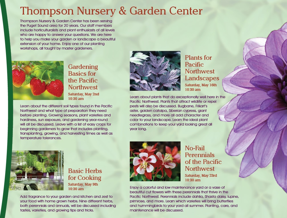
I created repetition in my design by using the colors and fonts from my logo for the colors and fonts of the text in the brochure. I also repeated the green curve on the right front of the brochure on the inside and the green dots from the logo to separate the phone number and hours on the back. I also picked photos for the classes that used colors from my color scheme.
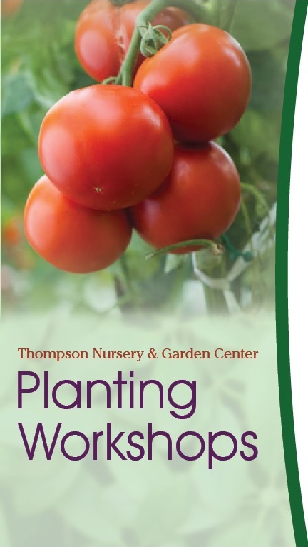
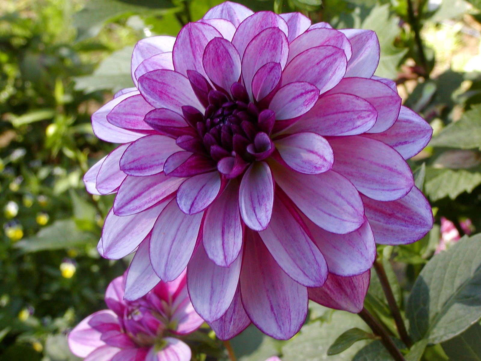
After selecting all my photos, I opened them in Adobe Photoshop and made adjustments to the levels and colors to make them match my color scheme better. For the tomato photo on the front, I used the lasso tool to select the main image and create a feathered opacity around it. I then used a mask and “painted” away the bottom edge of the photo with the brush tool at 50% opacity so the bottom would gradually fade away. I also deleted the background so the photo would blend in with my background on the cover of the brochure. For the dahlia on the inside of the brochure, I used the quick selection tool to select the background and then delete it. Then I opened the refine mask dialogue box and smoothed, feathered, and applied contrast to the edge of the flower. This made it have a softer edge that didn’t look so cutout on my brochure. I then “placed” the dahlia into my brochure and used the text wrap option to wrap my text around the petals by selecting the alpha channel option. I also copied the dahlia and added it to the back of the brochure, positioning it so that it looked like it wrapped around the edge of the brochure. This helped tie the back to the inside and add color and interest to it. For the background image, I found a high resolution photo of leaves and added a mask with a filter using a Gaussian blur. I then “placed” it in my InDesign file. I changed the opacity to 10% to make it more of a texture than a photo. When I did this the photo went very white. To adjust for this, I put a block of light green at 80% opacity behind the photo.
While arranging my photos and text, I applied the rules of body copy. I did this by aligning the bottoms of the columns, aligning text horizontally across the columns, placing headers closer to the text they introduce, adding more space above headers to separate them from previous text, using consistent paragraph styling, and getting rid of any widows or orphans.
Programs used: Adobe InDesign, Illustrator, and Photoshop
Message:
Thompson Nursery & Garden Center has planting workshops specifically for growing items in the Pacific Northwest.
Audience:
Anyone wanting to know what gardening preparation is needed or what grows best in the Pacific Northwest.
Top Thing Learned:
How to cut out an image in Photoshop, refine the edge, and wrap text around it in InDesign.
Color Scheme and Color Names:
Split Complementary
Green
Violet
Brick
Title Font Name & Category:
ChelthmITC Bk BT – Oldstyle
AvantGarde Bk BT – Sans Serif
Copy Font Name & Category:
AvantGarde Bk BT – Sans Serif
Word Count of Copy:
309
Thumbnails of Images used:


Sources (Links to images on original websites):
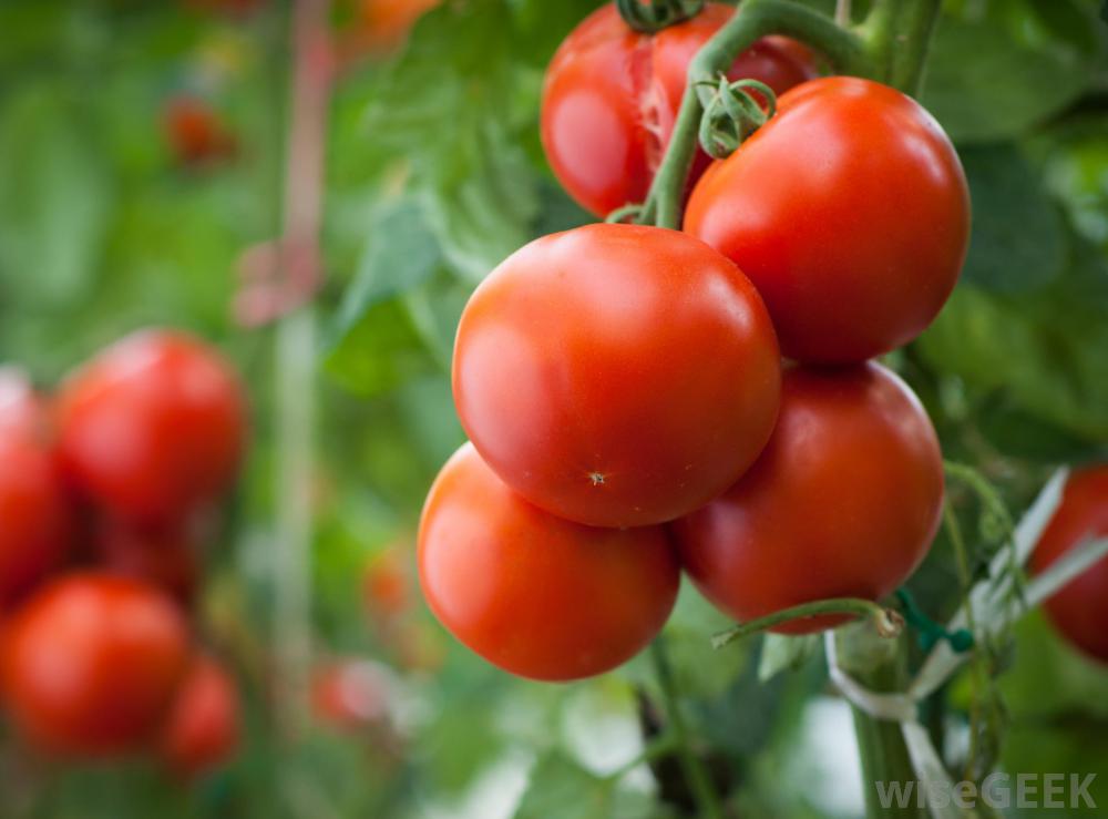
Tomatoes: http://images.wisegeek.com/tomato-plants-with-large-red-tomatoes.jpg
Strawberries: http://gardenclub.homedepot.com/wp-content/uploads/2014/06/strawberries-SS-560×400.jpg
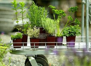
Herbs: http://static.seattletimes.com/wp-content/uploads/2009/06/2009315592-300×0.jpg
Bugbane: http://images.meredith.com/content/dam/bhg/Images/2012/03/SIP929229.jpg.rendition.largest.jpg
Columbine: http://getgrounded.files.wordpress.com/2009/03/20090315_red-columbine.jpg
Dahlia: http://yourparadisecreator.com/dahlia%20seduction.jpg
Leaves: http://www.cgtextures.com/thumbnails/textures/nature/Hedges/Hedges0050_1_thumblarge.jpg

Hi Jocelyn!
You have quite a nice project here! My absolute favorite part is that beautiful photograph of the purple flower on the back of the brochure. (I’m also a little partial to purple.) 🙂 I think there is a great use of repetition with the faded photograph of the leaves. It really helps unite the design and it also provides some nice texture to it. I also like your cute logo! Great job!
Here’s my project: https://sarasreflections.wordpress.com/2015/07/12/project-8-brochure/
LikeLike
Jocelyn, your design looks great! I LOVE the curved edge of the brochure. I also really enjoy the background image that you used. The green leaves are subtle but do wonders. This brochure makes me want to garden! I love the type choice and bright colors that are used. I think you would also enjoy looking at Sara’s design at https://sarasreflections.wordpress.com/2015/07/12/project-8-brochure/comment-page-1/#comment-19
LikeLike
Jocelyn, I really love your brochure design, the curve is so cute. I love how there is the gorgeous purple flower behind it and the flower really pops off the page from the background image. It looks really professional and has great repetition and consistency throughout. I love it.
LikeLike